The project that I thought would never end is finally finished!! My master bathroom has been one of those spaces that has always puzzled me since we moved into our home eight years ago. I could never figure out what direction I wanted to go in. Since this bathroom has a ton of tile that carries on into our shower, I knew that I had to somehow decorate this space around the tile. After months of planning and waiting, I think I finally got this space right. I am so excited to reveal it to you today along with share a few easy ideas for updating your dated bathroom. Before I share how it turned out, let me remind you what it looked like when we moved in. It’s hard to believe this is the same space. It’s amazing what a little bit of paint, wallpaper, and vision can do!
Master Bathroom Before…


Dark and depressing is how I would describe it. The paint color was orange, the counter tops were pretty but not my style, and the wood cabinets had orange tones that were so hard to work with. Since I knew the tile had to stay, I decided to change everything else including the countertops, cabinets, hardware, mirror, and lighting. I can’t wait to show you my master bathroom reveal.
Master Bathroom Reveal

So here is the new view of my master bathroom. So much better!! The first step was to change the paint color. The paint color is called Alabaster by Sherwin Williams. I have used this color throughout most of my house, so I decided to keep it going through my master bathroom reveal. Painting the walls a lighter color was a great starting point to brightening up my master bathroom. You can also see how this space looked the first time I made it over HERE.
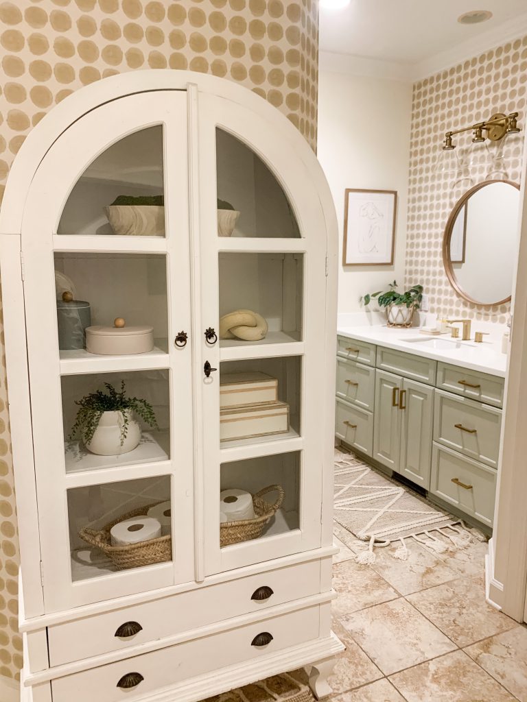
Let’s talk about this cabinet. The first thing you see when you walk in is a wall that is behind our shower. I wanted this wall to be the focal point of the room. I lucked up and found this beautiful arched cabinet on Facebook Marketplace for $125 and it fit perfectly. It looks like it was made for this little wall. It has been so much fun decorating this cabinet. It is also the perfect storage cabinet for toilet paper and extra wash rags and towels.
Bathroom Details
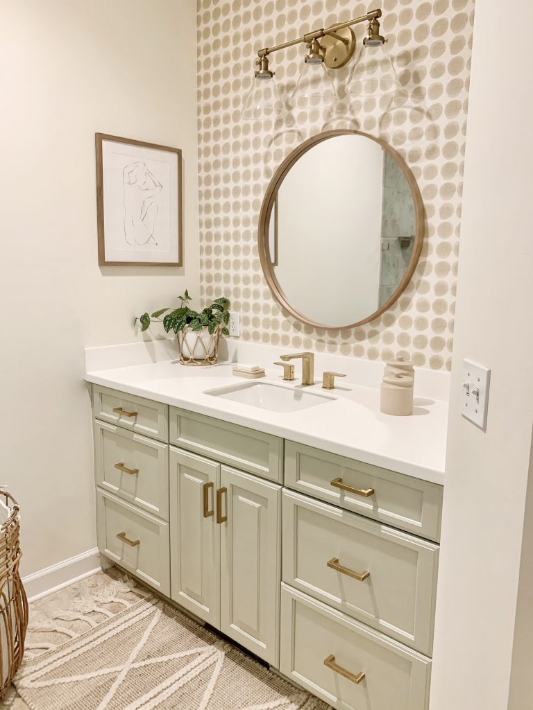
Let’s begin with the vanities since that took on the biggest change. The first thing that had to go were the countertops. I just could not work around them, so I chose to go white. They are from The Home Depot and the color is Arctic White Although they are simple, I love how they look! They help set a beautiful tone for the rest of the space.
Lulani Faucet
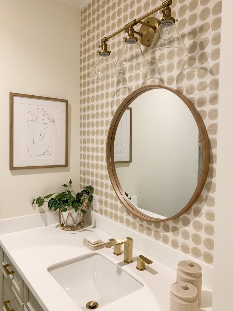
The best way to add beauty to a basic white countertop is to add a gorgeous faucet. I found the perfect faucet from Lulani and fell in love with shape and color.
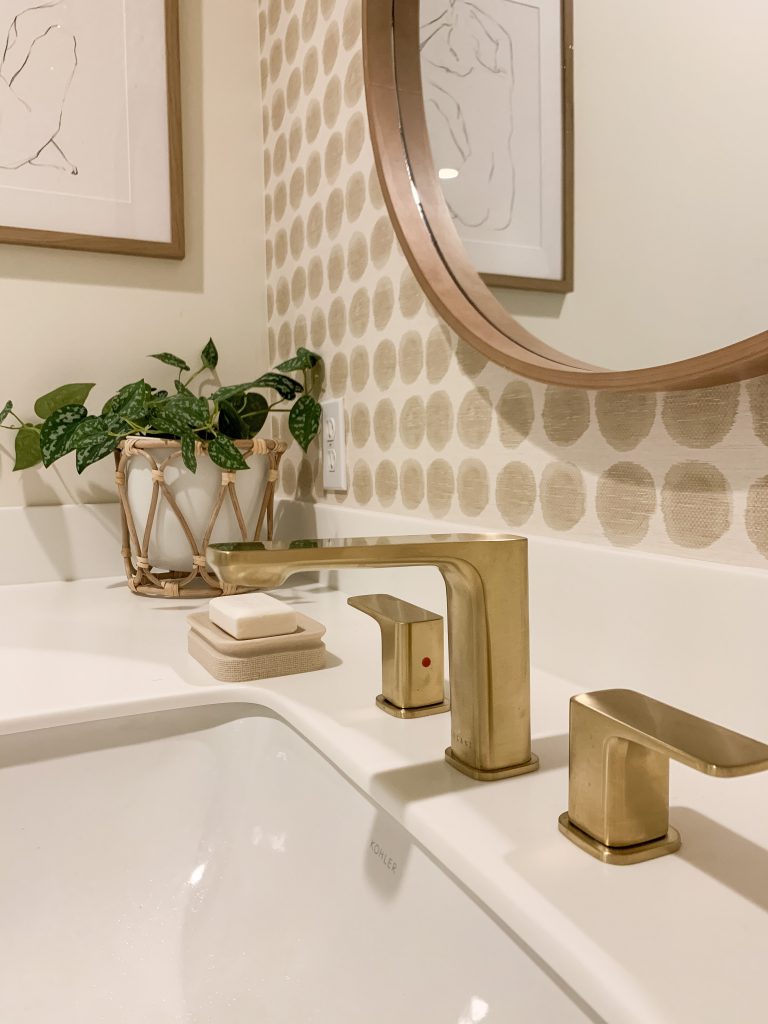
This faucet is called the Corsica Faucet, and I chose the champagne color. It added the perfect elegance to my vanities. If you are in the market for new faucets for your home, I highly recommend Lulani for their quality products and amazing customer service! I am so in love with how this faucet looks in this space!!
Cabinet Paint and Hardware

The next big step was to change the cabinet color. I decided to go with the color Jogging Path by Sherwin Williams. I first primed them using Kiltz and then did 3 coats of cabinet paint by Behr. To finish off the new look, I added these pretty and budget friendly brass cabinet pulls. Love how the light paint color looks with a touch of gold! In total, painting the cabinets and adding new hardware cost me around $150. This made a big punch for a small amount of money.
Peel and Stick Wallpaper

After I finished painting, it felt like this space was missing something. That’s when I decided a fun wallpaper would add some much needed character to this room. Also, I thought it would also be a great way to tie in the floors to the rest of the decor. I found this Textile Dot peel and stick wallpaper at Target and love how it really pulled the room together. I added it above each vanity and on the wall behind the cabinet. Using it in small spaces added a fun pattern without being too busy.
Bathroom Rugs

If you know me, then you know I love adding the perfect rug to finish off a makeover. I found these beautiful tan jute rugs from Boutique Rugs and knew they were the perfect ones to tie this room together. It is called the Gulnur Area Rug and it has a beautiful blend of jute with raised wool details. I also love the tassel details on each end. I am completely obsessed with how it looks in this room!

Master Bathroom Mirror and Lighting

To finish off the makeover, I added new mirrors and lighting to each vanity. I went with a simple round wood mirror . This mirror was a great way to mix in some wood tones since I went with brass in other areas. It also broke up the brass faucet from the lighting. I went with a simple and very budget friendly brass light fixture. I just love how it all looks together!

On my side of the vanities, I added this marble trey to hold my curling iron and straightener when they are being used to help protect my countertops. I also found this cute jewelry holder at HomeGoods. It’s a great way to keep your favorite jewelry on display.

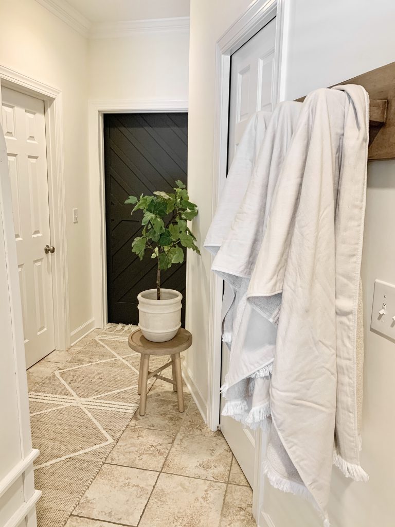
This bathroom used to be a place that I never wanted to spend time in. Now, I can’t stop going in there. It now feels peaceful and relaxing, and I am so happy all of my hard work paid off. So guys, that wraps up my master bathroom reveal. I hope you enjoyed the tour and maybe even got a few ideas on how to update your outdated master bathroom. Thanks for stopping by and have a great day!!
Shop The Post
Pin For Later




The update looks great, so fresh & bright! Quick question, did you use anything else on the painted cabinets? Like a top coat, wax or sealer?
Hi Michelle! Thank you so much! So happy you like it. If you use the cabinet paint, it has sort of a shiny finish perfect for cabinets so there is no need to seal it or anything like that. The paint was a bit more expensive but totally worth it.
Love what you’ve done with the bathroom! Did you keep the same floor tiles?
Thank you so much!! Yes, I kept the floors because I could not take on that project right now. I tried to design around them, and I actually like them now so much more now. Replacing the floors will hopefully happen in the future.
Carissa it looks absolutely amazing! I love that arched hutch you scored on the marketplace.
Hi Donna! So sweet! I am so happy you like it! Thank you! I was so excited to score the cabinet. It still needs repainting and new hardware. I’ll probably do that soon!
You’re so welcome! Can’t wait for more of your updates.
Ok I was NOT expecting that reveal, so beautiful! Love love the wallpaper and the cabinets. Thanks for some amazing ideas!
Hi Brenna! Thank you so much for your sweet compliment! So happy you like how it turned out!