
Hello friends and happy September! Can you believe fall is right around the corner?!? That makes this girl so happy!! As promised, I’m bringing you part 2 of a client’s beautiful farmhouse refresh where I’m creating a farmhouse style kitchen and dining room area. I was lucky enough to work with a client who owns their own construction company. I can take credit for some accessories and paint choices, but that beautiful ceiling and shiplap wall you are about to see is all Cross Driven Construction. Wait until you see these beauties!
Kitchen
Creating a Farmhouse Kitchen
We will start with the kitchen. The before is already beautiful, but my client wanted to lighten up the space and add some farmhouse touches. Oh, and a gorgeous barn wood ceiling. I mean, come on…a real barn wood ceiling!! Let’s just say I about fell out when I saw it!
Before…

After… (Sorry for the poor lighting. It was very bright outside.)

A barn wood shelf was added above the sink and opening so that called for some fun farmhouse goodness. Don’t you just love the cow picture?

I had so much fun decorating this shelf! Love how open shelves add so much character to a space. Love how this little window opening turned out!!

Ok, so like I was saying, the before is gorgeous. Just look at that barn door. Just another beautiful touch from the homeowner.
Before…

Ok, wait for it…..just look at that ceiling!!!! It’s seriously a stunner!! I have major ceiling envy!


Isn’t this light fixture amazing?!? This was made from vintage oil cans found at the flea market! Another beautiful touch from my talented clients!

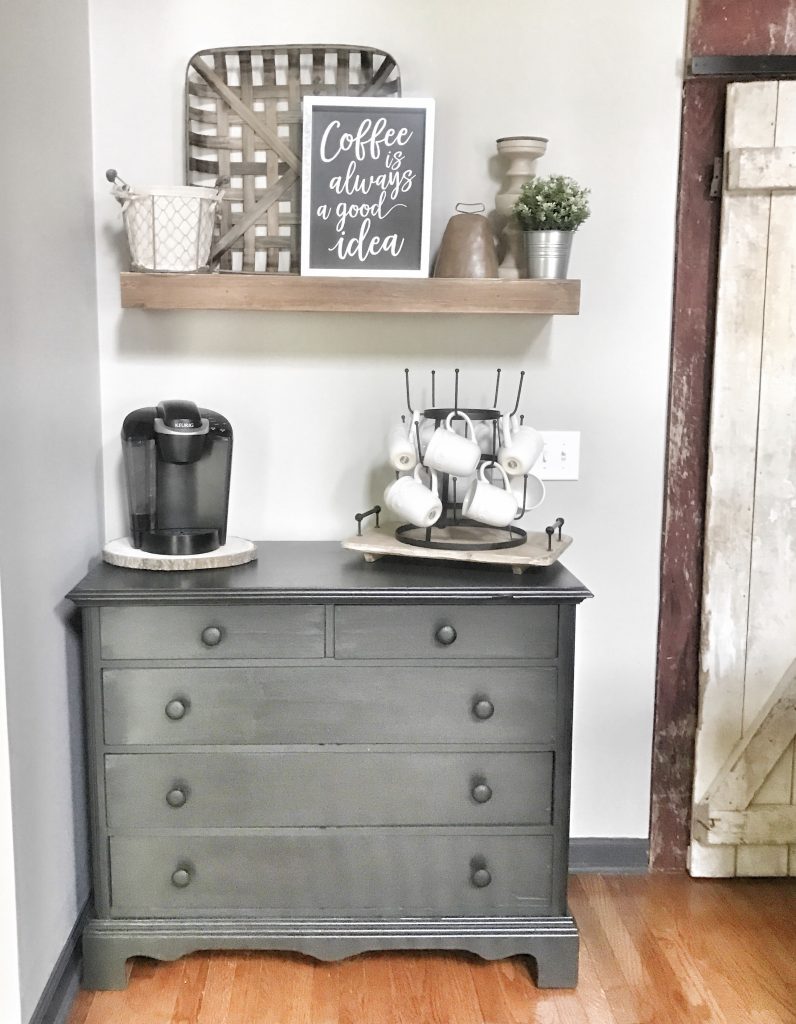
Cutie farmhouse coffee bar!!
Dining Room
Creating a Farmhouse Dining Room
Our goal for this space was to brighten and clean it up. This is where all of her extra decor fell. She seriously has so many beautiful accessories.
Before…

We added Repose Gray by Sherwin Williams to the walls. I love this color because it brightens and adds a clean, open look. It changed the looks of this room with just a few coats of paint. We added a tobacco basket and a few simple accessories. Now, this room is a beautiful place to share a meal with family!


So, let me introduce you to the other side of this room. I love this red fireplace that is on the opposite side of the room. It is so cute, but it blended in to the decor and didn’t really pop like it needed to. We knew this wall needed something special so shiplap came to mind. Just wait until you to see another beauty that the homeowners created.
Before…

After…
Isn’t this just beautiful? The white shiplap walls were the perfect touch to this room and now this little red stove stands out like it was intended to. I am so in love with how this space turned out. Oh, did I mention they also made this wood and metal firewood holder? Gorgeous!! It was the perfect solution to holding messy firewood for the stove.

Well friends, that wraps up part 2 of our refresh – farmhouse style kitchen and dining room. If you missed part 1, farmhouse style living room, check out that post. I had so much fun helping my client’s fall back in love with their home. I love doing what I do because loving your home is one of the most important parts of being a homeowner. You need to love where you come home to and never want to leave. The space should reflect you and your family’s personality. It should be a cozy space that you absolutely love. It makes my heart happy to have a small part in helping someone love the place where all of their favorite memories will take place. Thank you so much for following along with me on this little refresh! I hope you love their new space as much as I do!
XOXO- Carissa




Leave a Reply